Hive
Brand Creation

Overview
Hive is an online marketplace of brands committed to crafting great quality products while making a positive social impact.
Hive believes in business as a force of good. At the beginning of their journey, they found tons of brands who have been doing the right thing from the very start. But they also saw what was missing: Making it easier to connect people who shop their values with brands who live those values.

They set out to create a collective of like-minded people and companies, drawing inspiration from the beehive—a place in nature where a community works together for something bigger. And so, Hive was born.
Project
Turning values into something recognizable
The Hive wordmark’s serifs are soft and round. They evoke the oozy essence of honey dripping off a spoon. The rounded curvatures of the letterforms reach out like a hug to add warmth. The lowercase "h" creates an approachable space, and the "e" is slightly tilted, leaving a smile as the last impression this wordmark makes.Branding.
Commerce.
Experience Design.
Product Strategy.
Packaging.


Hive’s primary Typeface is Recoleta Alt. This typeface provides a down-to-earth feeling to the Hive brand, creating a sense of warmth and approachability.
Recoleta Alt is also both timeless and strong in personality. The interesting letterforms owns the uniqueness Hive provides to their consumers.

Basis Grotesque Pro is the secondary typeface. This typeface is rounded and geometric, complementing the roundness and organic nature of the primary typeface. Basis Grotesque still has personality in its letterforms but doesn't overpower the wordmark and primary typeface.
Hive’s color palette is inspired by their own pantry assortment.
The primary colors are bold and warm, while the secondary colors add an additional breadth of neutral and complementary color.
Mustard

Seaweed

Flour

Liquorish

Rosehip

Nutbutter

Thyme

Seasalt
At the start, Hive was only a concept. To fulfill its mission, the product team was tasked to test and prove out a viable product.
The purchasing funnel had to stay true to the mission: make it simpler for people to buy what they believe in. Everything on Hive is meticulously vetted by merchants and sustainability experts, so this was important to convey to users through light-weight education without “finger wagging.”
During the initial stages of research, we had open conversations with users who already shopped consciously.
Consistent themes and insights were quickly uncovered. It was too time consuming. Between work, family and life—it was a lot of extra time to do any research on what were the best brands to consume responsibly—and if they were trustworthy.  They wanted to be more sustainable, but what does that even mean? When it comes to certain categories or products—what’s the good and what’s the bad?   You can’t find everything in one place. A lot of people we spoke to had to go to specialty stores—especially when they didn’t live in or near a major city.

This research, along with concept testing, helped quickly prove out that Hive could fill a void in the marketplace.
Hive shoppers wanted an emotional payoff.
Through our user research, we had learned how there was affinity for brand loyalty to companies that not only had a quality product but also added value to the world in some way. It was important to bring this emotional payoff to the purchasing funnel through “pats on the back.” This allowed our users to feel confident about what they were purchasing while seeing the impact they had, each time they shopped.

By using macro imagery, we can tug on the senses of the consumer and highlight the perfectly imperfect moments we see in our food everyday.
Lighting is warm and natural, moments are savory and human and the food should make your mouth water.
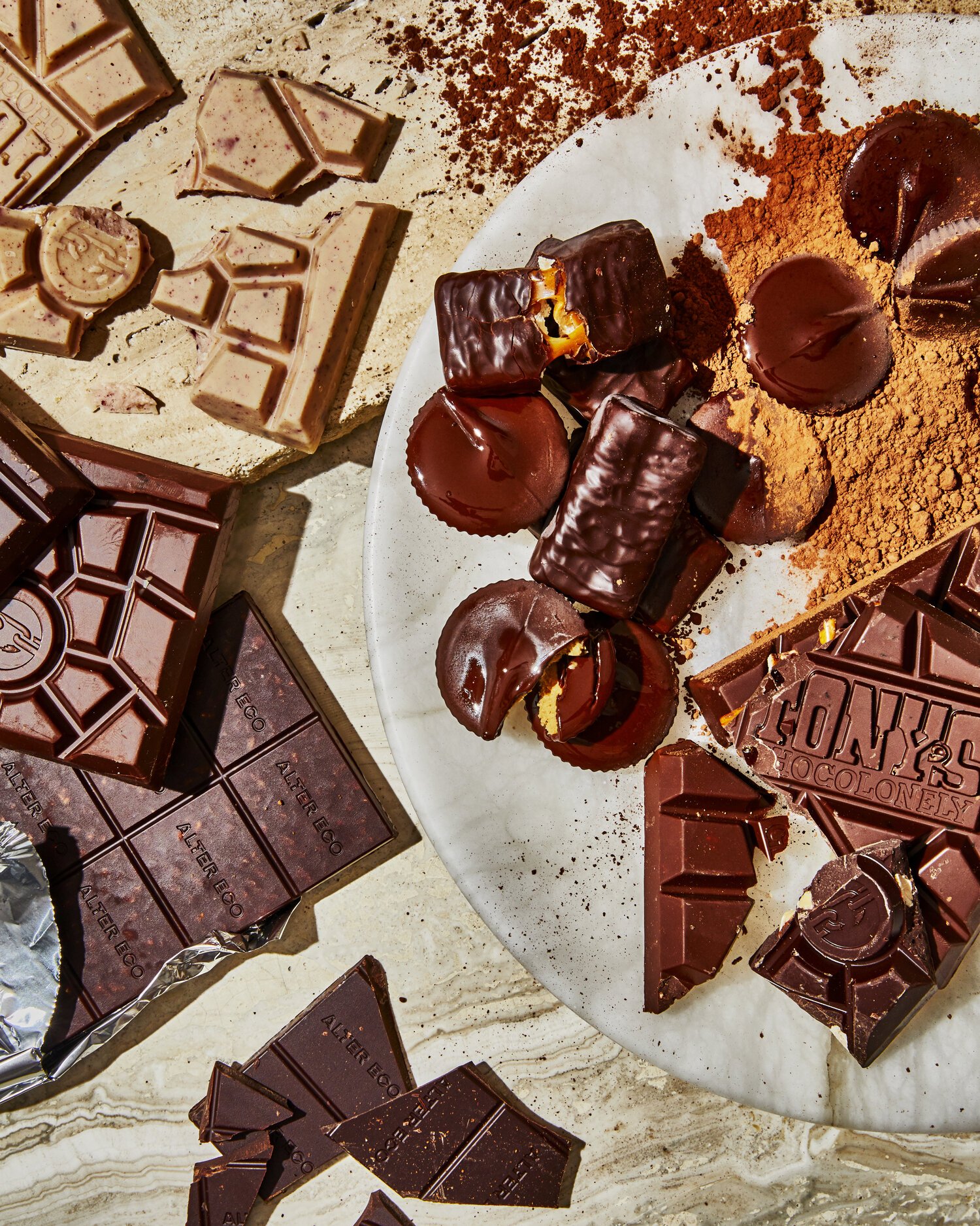
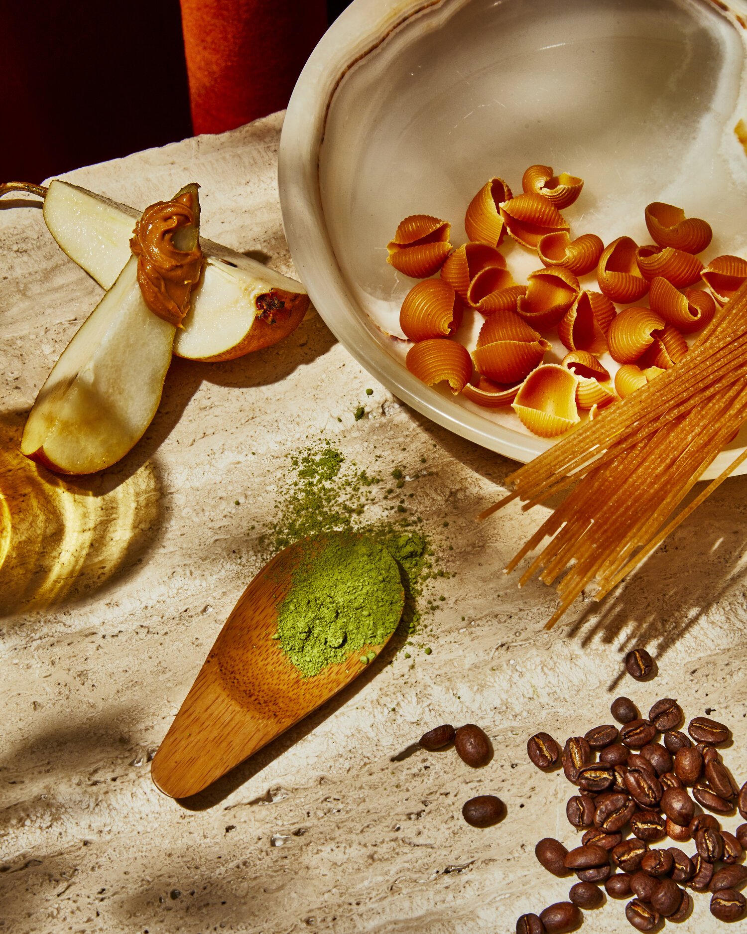
It was important for imagery to feel inviting without being fussy—as to not alienate anyone.
Using foliage and natural elements helped further push the connection of sustainability throughout marketing materials.
In Motion
Hive’s illustration brings a human touch to the visual system.
The organic shapes and colors create a warm and inviting element, paired with typography and photography.


Photography by Chelsie Craig, Alpha Smoot
Styling by Beth Pakradooni, Hadas Smirnoff, Erika Joyce
Design by Laura Mechling
Illustration by Antra Svarcs
Responsive website development by Brenda Storer, Erin Zobitz